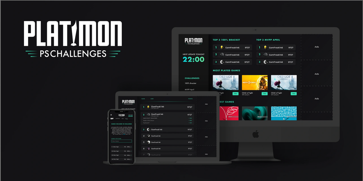
Playstation leaderboard platform
Case description
Platimon is a "challenge" platform, that collects and bases your score on your performance in other leaderboards from the PS 4/5 console. You could say it's gathering your total performance in other games and gives you one result.
My Process
1. Logo
The logo should have a "gamer" feeling and I used the cup or statuette instead of the "i" to establish a connection to the meaning of the game/challenge. It symbolizes a feeling that you want to triumph and win the leaderboards. The cup came to be the symbol that reoccurs in the badges to reconnect to the logo and brand.
2. Wireframes
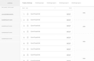
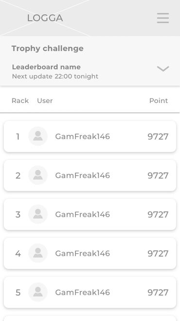
I made a few wireframes to demo how the interface should work and be transformed into a mobile appearance with the same data still visible. The UI has since then become a lot more complex than the first version.
3. UI Design & Branding
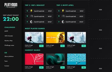
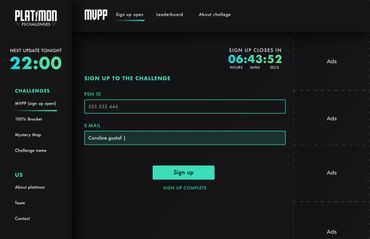
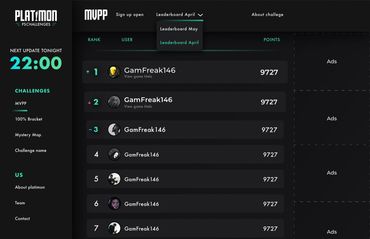
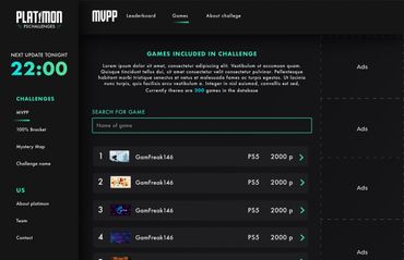
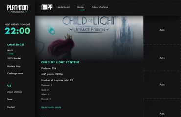
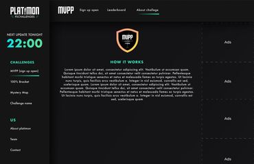
I was requested to use lime green and turquoise as complementary colors. I did not mind this it fitted my vision for the platform very well. My goal was to make a UI that would attract the users, in this case, gamers. A dark UI is very common within gameing and in the games themself. So it felt like a natural choice and it fits well with the complementary colors lime green and turquoise.
I have received some very appreciated feedback from the users that they like the UI and branding.
4. Frontend development
I used pure HTML and CSS to code the first version of the Platimon platform.
I have done as well as I can, at my competence level. The platform is responsive.
The pilot was intended to be a throwaway, and rebuild in the future.
To both design and then have to follow up with coding my own work has taught me that it's not always so easy to meet the design requirements and you have to compromise in order to both save time and keep it simple. That's why it might be some slight differences between my UI and my developed version.
Summary
Project from: 2021
Platimon is a "challenge" platform, that collects and bases your score on your performance in other leaderboards from the PS 4/5 console. You could say it's gathering your total performance in other games and gives you one result.
This was a pilot project, to test if the idéa was a popular concept by the users.
The pilot was intended to be a throwaway, and rebuild in the future.
I did both the UI design and coded the platform, at my competence level. The platform is responsive.
There might occur some bugs. I'm not a pro frontend developer. I do as well as I can.
SKILLS USED
HTML
CSS
UI Design
Graphic design
Branding
TOOLS USED
Sketch
Illustrator CC
Visual Studio Code
First wireframes
Platform design
Badges


User feedback

Den här webbplatsen använder cookies.
Vi använder cookies för att analysera webbplatstrafik och optimera din webbplatsupplevelse. Genom att acceptera vår användning av cookies kommer dina data att aggregeras med alla andra användardata.