
Car workshop portfolio
Case description
I created Garage when I aimed to learn a new design tool - Adobe XD. And to show off some of my UX skills. In this case personas and flow-charts.
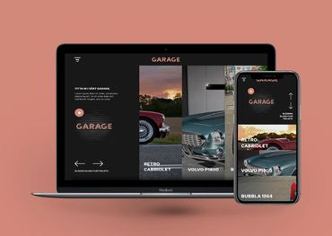
My goal with the web design was to create a guiding experience with the focus on viewing projects and sending business requests. With the help off animations I want to make the interface even more pleasurable to interact with and help user with where to focus on.
This would be very accommodating to the personas our users.
This project is a made-up one but inspired by my brother's hobby.
My Process
1. Branding identity
Storytelling Swedish name but same spelling and meaning in english. Good theme for short movie.
Inspired by object in the industry
Choosing colors to differentiate the brand from its competitors.
2. Personas
Imagine - car enthusiasts and stakeholders visit car shows.
I believe the main reason why they visit the exhibition are to get inspiration, knowledge and to find connections. The personas are defined based on my own assumptions and observations.
Why do the persona need inspiration and knowledge?
Why do the persona need to gain more business connections?
3. Flow-chart
After defining my two main characters I tried to map their workflow through the website and process when solving their tasks. I'm trying to find all possible endpoints when the user leaves the page and accommodate their needs as good as it is possible.
The flow-chart also works for me as an overview.
4. Low fidelity wireframes
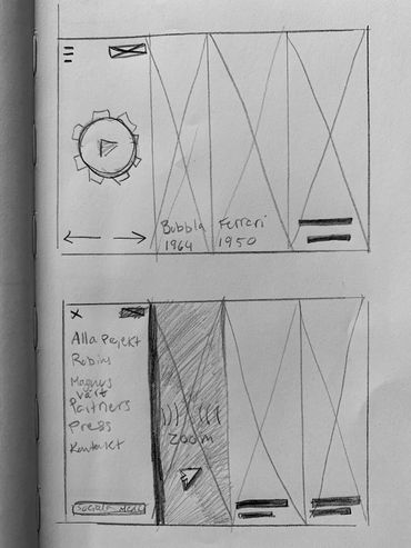
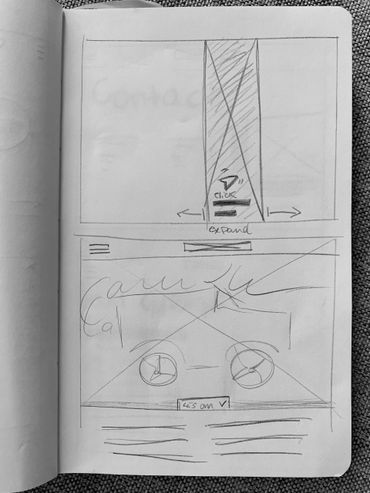
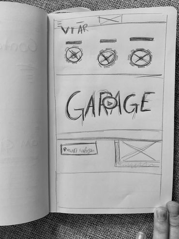
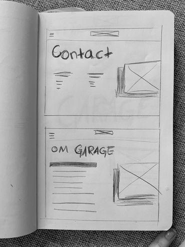
I started to sketch a brief paper wireframe off the website. With the goal to get a clearer image of my vision. I want to highlight projects and design a slightly different layout. The layout should have a horizontal interface that makes the user curious to browse the content that is shown after loading. During the wireframe stage I also start to shape how I want the animations to behave.
5. Web design
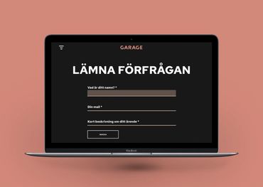
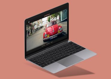
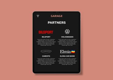
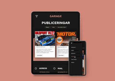
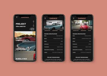
I always enjoy when it's time for color and interaction. My goal with the web design was to create a guiding experience with the focus on viewing projects and sending business requests. From the landing page I want a seamless interaction with as few clicks as possible to read more about a project or navigate to were you fill-out and send a inquiry. This would be inline with the personas's goals and Garage's business goals.
With the help off animations I want to make the interface even more pleasurable to interact with and help user with where to focus on.
6. Prototype
With this project, I aimed to learn a new tool, Adobe XD. I found it a bit challenging at the start but after a while, I appreciated the overview of the prototype and the design at the same time and the automatic animations. I had a clear vision from the wireframe stage how I wanted elements to animate in order to enhance the user experience and guide the user 's focus.
Summary
Project from 2021
PI created Garage when I aimed to learn a new design tool - Adobe XD. And to show off some of my UX skills. In this case personas and flow-charts.
My goal with the web design was to create a guiding experience with the focus on viewing projects and sending business requests. With the help off animations I want to make the interface even more pleasurable to interact with and help user with where to focus on.
This would be very accommodating to the personas our users.
This project is a made-up one but inspired by my brother's hobby.
SKILLS USED
UI Design
UX Design
Graphic design
Branding
Web-design
Prototyping
TOOLS USED
Sketch
Illustrator CC
Photoshop CC
Adobe XD
whimsical.co
UX

Persona 1
Why do the persona need inspiration and knowledge?
- solve mechanical problems on their own hobby projects
- to gain insight to the industry
- find motivation
- find possible role models
- to gain new ideas
- knowledge exchange

Persona 2
Why do the persona need to gain more business connections?
- to make their own business grow by investing in other companies
- to gain new ideas
- knowledge exchange
- to relieve personal load (stress, make time)

Flow-chart
After defining my two main characters I tried to map their workflow through the website and process when solving their tasks. I'm trying to find all possible endpoints when the user leaves the page and accommodate their needs as good as it is possible.
The flow-chart also works for me as an overview.
Sketches
Website
Prototype
Please use the button below to view the full website design. I have configured the prototype somewhat so that there are animations. The animations would significantly improve the user experience if it was a fully developed website.
Branding
Den här webbplatsen använder cookies.
Vi använder cookies för att analysera webbplatstrafik och optimera din webbplatsupplevelse. Genom att acceptera vår användning av cookies kommer dina data att aggregeras med alla andra användardata.