
Digitizing Esport tournaments in an app
Case description
Etonax is an app that focuses on gamifying and digitizing Esport tournaments.
It’s a product in its very early days, where I have been involved from the start.
It’s an iterative process where I have designed many concepts that have been used and then evaluated and changed. Like for most start-ups, the way forward isn’t always clear. You have to bump into ups and downs, take two steps forward and one step back in order to reach a solid ground.
My Role
I have designed the app whole app alone, both the UI and UX, but I’ve put a great focus on the user experience so our end-user wants to keep using the app.
I have also been involved in the creative thinking of concepts and game ideas that we can use in the app and on other platforms like the web and social media.
I’ve been responsible to create marketing content like campaigns, images, videos that we have used in social media.
Another big part I have taken in this project is as a spokesperson for the product.
We have been looking for a lot of partners to work with, so this has required me to attend several meetings and events where I have pitched our ideas to a crowd that has other domain knowledge than myself. This has been a challenge where I’ve had to align my knowledge about Esport to someone very new to the subject.
My Process
1. Conceptual screens
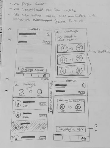
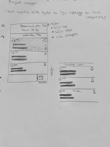
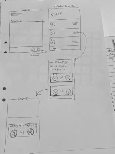
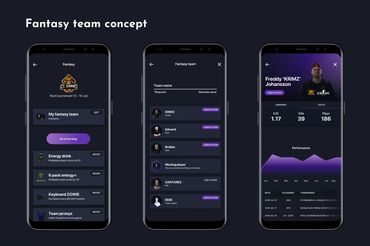
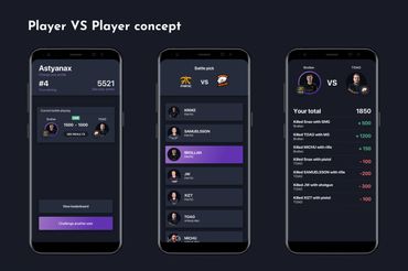
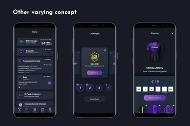
At the start of this project the concept wasn’t very clear, I received a brief that the user was going to play different challenges on top of a CS:GO tournament and that the challenges could vary. This meant that I needed multiple different layouts.
But the point here is that we were missing a red thread, what should happen after you played? This process got us thinking that we needed to close the user journey in a good way. But how?
At least the app-design established some colors that I would use in future branding.
2. Branding
The name Etonax means “king of the tribe”. It comes from Greek where the words - Anax is an ancient Greek word for "tribal chief, lord, (military) leader" and éthnos means "tribe, country, nation”. So when interpreting that as - we wanted- it became = Éthnos + Anax = Etonax.
My goal was to create both a typography logo and a symbol. The Symbol would later be used as the primary logo when the brand would be established. The symbol would also work as our app icon and replace the typography logo in small areas.
It was important to me that the main logo and the symbol would remind of each other.
The current branding covers logos on different backgrounds, light, colored and inverted usage.
We use imagery with gradients to strengthen the feeling of E-sport together with our brand.
3. Usability test
We ran some A-B usability testings with a prototype that I built in inVision.
We tested different onboarding concepts. During the test, we received some valuable insights.
4. Minimum viable product
We iterated after the test and reached our first stable version of the app.
5. Product website
I designed a website that presents our app and its features. When I later tried to develop it, I wanted to learn a (for me) new tool called Webflow. https://www.etonax.com/
6. Iterate forever and ever
As mentioned earlier, the road ahead is not always straightforward.
We have iterated many times and come up with new concepts over time. In this project description, you will see many different screens but it might not always be clear how they tie together.
I hope that the variety of screens will show that I want to find a sustainable concept that has good usability. That I adapt to the situation and don’t quit.
This is an ongoing project where the app continues to evolve and so does my involvement. Currently, everything I do for Etonax is in my spare time.
Summary
Project from: 2019-2020
Etonax is an app that focuses on gamifying and digitizing Esport tournaments.
My involvement in this project has been very wide. I’ve done everything from UX/UI, marketing content like campaigns, images, videos for our social media, entertaining concepts for the app and pitching our app idea in meetings.
This is an ongoing project where the app continues to evolve and so does my involvement. Currently, everything I do for Etonax is in my spare time.
SKILLS USED
Concepts
Branding
UX Design
UI Design
Mockups
Prototypes
Usability tests
Marketing
TOOLS USED
Sketch
Illustrator CC
Marvel App
Principle
Premiere Pro CC
Zeplin
Google Slides
Webflow
Facebook Ads manager
Sketches
App design
App store screens
Storyboarding for video

Videos
How I created the logo
Here is a quick video of when I created the Etonax logo and the symbol.
We want to gradually as we establish the brand, use the symbol more and more
MVP Concept video
This is our current MVP concept, the video is created with Principle and Premiere Pro CC.
(We do not own the video clips in-between the product sequences)
Branding
Den här webbplatsen använder cookies.
Vi använder cookies för att analysera webbplatstrafik och optimera din webbplatsupplevelse. Genom att acceptera vår användning av cookies kommer dina data att aggregeras med alla andra användardata.
